Project Overview
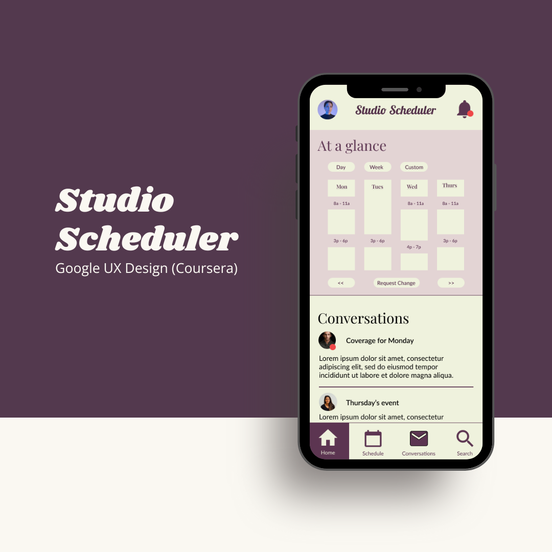
Coursera’s Google UX Design certificate included three end-to-end projects, allowing students to practice the design concepts learned in the program. Studio Scheduler was the first of these projects. It’s a fictional project to help facilitate scalable growth for art gallery owners and managers by creating a scheduling app to centralize employee management and operations.
The problem
Art galleries are losing time, revenue, and artists through miscommunication and scheduling mishaps.
The goal
Design a scheduling app for art galleries that effectively manages exhibit and employee schedules, prioritizes ease of use and flexibility, and caters to the needs of both art gallery owners and managers, as well as employees and interns who receive and follow the schedules.
Key skills
The design process
Paper and digital wireframes
Taking the time to build out the initial wireframes helped me to collect my thoughts around the musts and nice-to-haves of this project. It helped to clarify my vision for what the app would look like, even as the iterations looked more and more different from these original ideas.
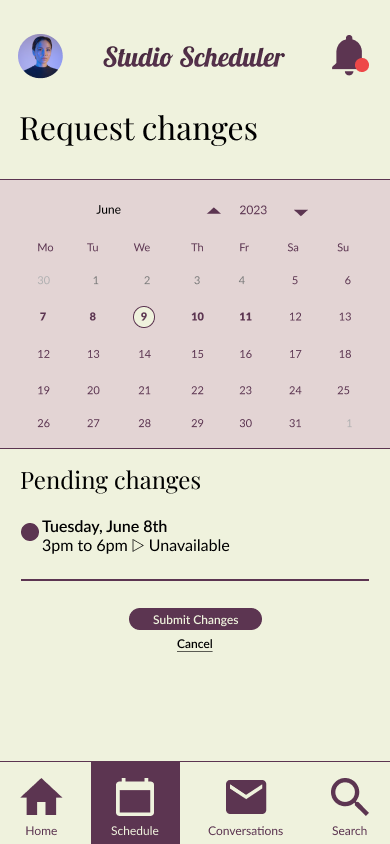
Since my initial research indicated that gallery owners and employees needed a centralized way to communicate and track requests, I decided to focus on creating a homepage and inbox experience. The design centered around displaying the most important information at a glance, allowing for easy communication, updates, and change requests.
Usability studies
Conducting a usability study allows designers to observe people interacting with and providing feedback on their designs. For this project, I conducted two usability studies using the prototype feature in Figma.
Participants were asked to try a small variety of workflows and to share their thoughts on the processes, which influenced changes for the final website design.
Round 1
Round 2
Mockups
Almost all participants reported a need for more context when viewing the schedule. From this feedback, we’ve created an updated mockup that showcases a variety of filters and views to enhance the calendar’s usability.

In addition to improving the calendar view, I designed an additional feature that allows users to toggle additional calendars on and off from view.

Almost all participants reported confusion around navigating to the main features of the app. To improve the navigation experience, I updated the information architecture and created a more engaging, in-app menu.

Takeaways
Impact
The app integrates with the unique needs of art galleries, balancing time and resource management with flexibility.
What I learned
There is always more to improve! For my first project focused on UX and app design, it felt like a challenge to iterate on the first mockups. Now, I see they were only the beginning. Through each iteration stage, I developed more and more ideas.


