
Project Overview
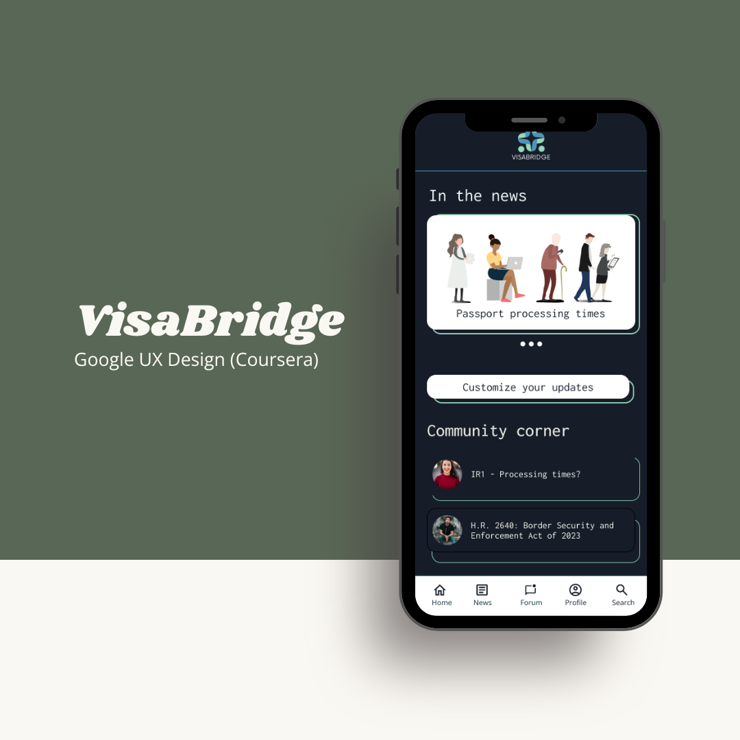
Coursera’s Google UX Design certificate included three end-to-end projects, allowing students to practice the design concepts learned in the program. The final project in the course focused on designing for social good. For my capstone project, I created a fictional app called VisaBridge, an app to help first-generation immigrant families navigate the visa and naturalization process.
The problem
Navigating the United States immigration process can be challenging and frequently requires an in-depth understanding of the US legal and political systems. This creates barriers for first-generation Americans and visa holders to understand and participate in policy changes that may impact their immigration status.
The goal
Create a mobile app to help visa holders and immigrants to the US more easily understand, follow, and take action on policy changes that affect their residency.
Key skills
The design process
Paper and digital wireframes
When designing the paper wireframes, I wanted to get a bunch of different ideas down on paper. This was a great way to experiment with a variety of modules/widgets before narrowing the design.

Starting from the homepage of the app, I really wanted to create an engaging environment by focusing on the app’s community and customizations.


Usability studies
Conducting a usability study allows designers to observe people interacting with and providing feedback on their designs. For this project, I conducted two usability studies using the prototype feature in Figma.
Participants were asked to try a small variety of workflows and to share their thoughts on the processes, which influenced changes for the final app design.
Round 1
Round 2
Mockups
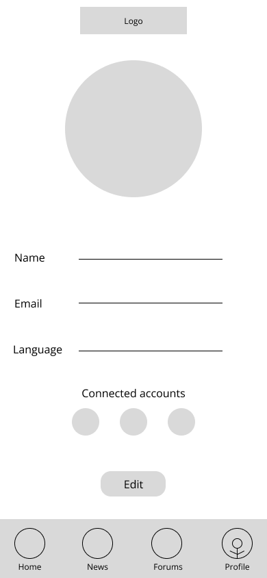
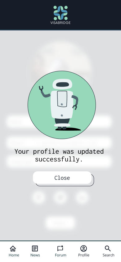
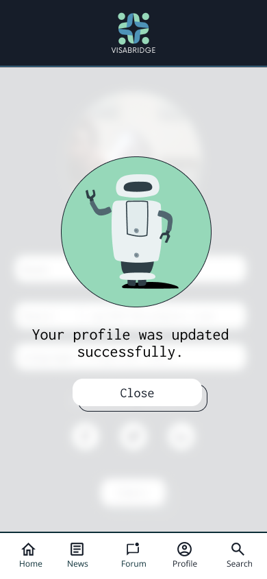
To refine the profile experience, I combined the labels and text input into a single field. During the usability study, almost all participants requested a confirmation page for changes.
Before testing
After testing

The customization quiz streamlines the experience with simple questions and engaging illustrations. The questions are optional for user comfort and privacy.
Before testing

After testing

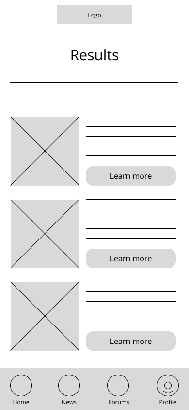
Each individual article about various bills or policies are broken up into smaller sections to make it easier to understand. Users can track specific bills that relate to their case to stay up-to-date.
Before testing

After testing

Takeaways


Impact
The VisaBridge app and website helps to fill a gap for first-generation immigrants concerned about immigration policy changes. It also helps to build a local community, through forums and events, while educating and empowering users about their cases.
What I learned
This project was challenging due to the nature of the material being highlighted. Policy and laws are often very text-heavy and can be daunting to navigate. It was an excellent challenge to seek ways to make the app design engaging, inclusive, and approachable.